Throughout the course of designing graphics for web interfaces I learnt a few tricks to improve the look of a screen-based image.
Here are a few of my favourites:
1. The “Grain and Lightbeam”
This effect takes advantage of the tendency for the human eye to always see plain colours in terms of grain and light. Though you hardly notice, any plain colour surface you encounter in the real world always has some texture and shadow on it (try look closely at a plain A4 white sheet to see this), the trick here is to replicate this on the screen to improve the effect of your design.
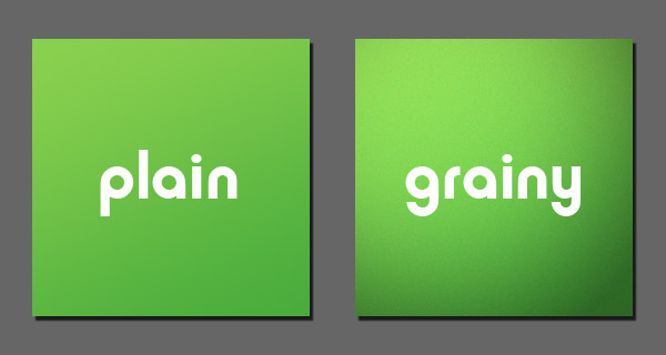
Use light and graininess to give plain colours a "real" look
In addition, adding a slight grain (1-2%) to colour gradients will make them look a lot nicer when they are printed. You will often get the advice from printing professionals that any gradients should be short and blend 50% or more between primary colours in order to avoid banding, however this is not necessary if you add a slight grain to your image.
2. The “Top Shine”
This effect is used to improve the look of any button or “widget” that you want to add volume to on the screen. As with the “grain and shadow”, this effect mimics the interplay of light on objects in the real world, in this case, the tendency for dark objects to shine with light when they stand out 3-dimensionally over a plain surface.
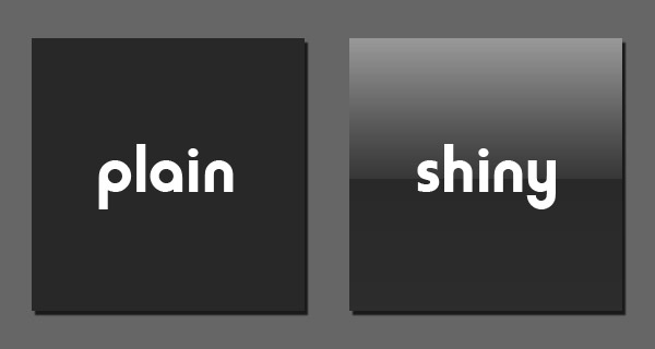
Make your objects (buttons, toolbars etc) shine with a top-light.
Notice that the “top shine” also has a less-noticeable “bottom shine”, which also occurs in the real world, although this is not as important this kind of detail will produce a small improvement over the simple “top shine”.
3. The “Diagonal Bands”
This is one of my favourites for backgrounds or to add a border, a very simple pattern of thin or fat diagonal beams at a slight contrast from the background colour will look very nice when you place a plain box over the top of it.
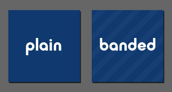
Add diagonal banding to your backgrounds to spruce them up
4. The “Text Etching”
This effect is used a lot by Apple © products to improve the look of any text on the screen.
The trick here is to use a colour for the text that is dark (black/dark grey) and then add an off-white 1 pixel shadow at the bottom, giving the appearance that the text is etched on the surface and improving contrast.
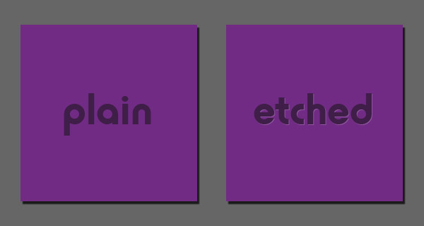
Use a 1px white shadow to give the appearance of "etching"
5. The “Font Vector” trick
Fonts are incredibly powerful tools for design when you take full advantage of their use as vector images.
That means that they are available at any size you care to use (8 pt to 6000 pt). In other words, if you need a big fat star: why not use an asterisk (*) and blow it up to the size you need?
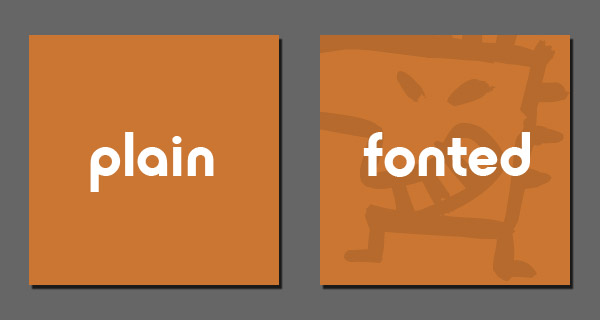
Use fonts as vector images to quickly achieve the look you want
Doing this will often save you a lot of time. In addition there are a lot of fonts available free to download that contain special outlines that would require a lot of effort to build from scratch (maps, silhouettes, brushes etc). Since these are vector images they can also be re-sized as needed. The example shown here is using the font: Creatures.
