=

desalasworks presents:

a portfolio of work by steven de salas

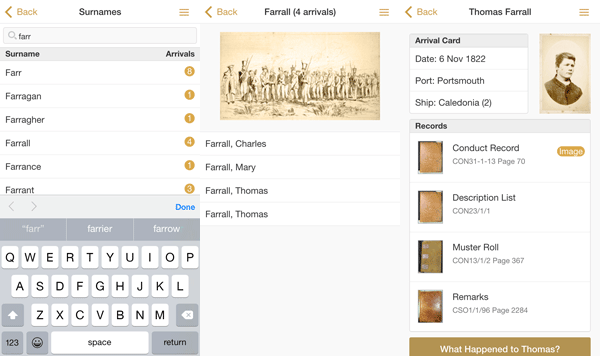
Tasmanian Convict Finder

Browse and search through detailed records of 85,000 convicts transported to Tasmania and those convicted locally through the convict system (1803-1893).

tasmanian-convict-finder

This app uses publicly available data from data.gov.au provided by LINC and the Department of Education in Tasmania, as well as newspaper articles sourced from the National Library of Australia.

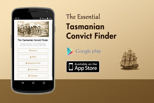
It is cross-platform and available in both iPhone and Android version.

google-play-en@2xapple-app-store-icon


Research your Ancestry

The app provides a useful reference for anyone seeking to find out more about the convict history of this beautiful island in Australia, and is a handy pocket guide for people researching their ancestry.

tasmanian-convict-finder.workflow

Initially built as an entry into Govhack 2015, this app was completed though unfortunately not in time to join the prize lists.

Environmental Defenders Office

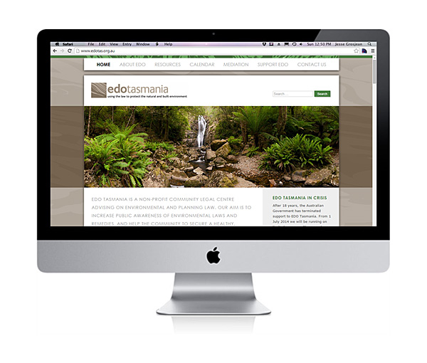
This project was a custom WordPress Template build for the Tasmanian Environmental Defenders Office.

edo_tas_desktop_screen

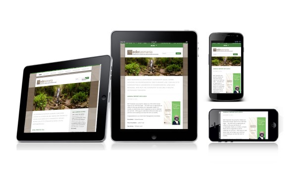
The project included responsive support for Tablet and Mobile devices at various resolutions:

edo_tasmania_devices

The website went live in late November 2013, just in time to help the Environmental Defenders Office establish its online presence before the government removed funding for the EDO network.

XXXX Island Competition

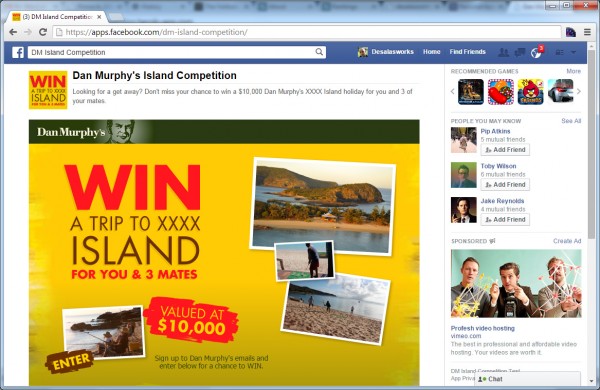
The XXXX Island competition was a Facebook Competition run by Dan Murphy’s.

This was produced in conjunction with RedJelly, an advertising agency based in Tasmania.

dm_island_competition_desktop


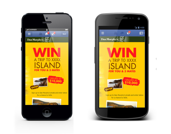
The competition had to be available on both Desktop and Mobile formats.

dm_island_competition_mobile

National Advertising: Dealing with High Volumes

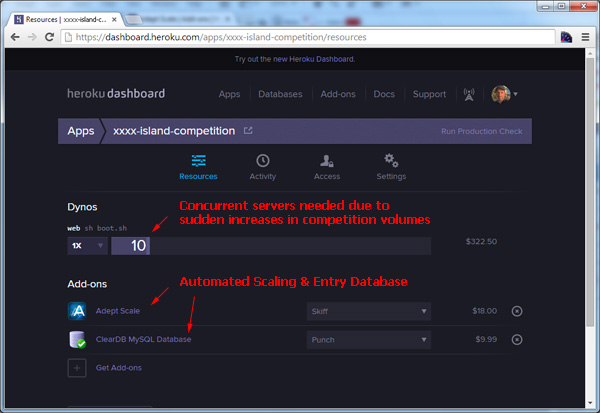
Due to the high volume of competition entrants the competition was hosted with Heroku, which allowed provisioning of additional servers to handle surges in traffic following advertising.

dm_island_competition_heroku

The competition was highly successful, receiving more than 10,000 entries.

MBTA mTicket

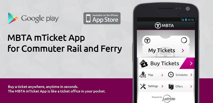
A 6 month cross-platform (iOS and Android) mobile app project for Masabi, a specialist mTicketing company based near London Bridge. The MBTA mTicket application was launched in the Android and iPhone app markets in November 2012, and was a complete success grossing $1 million of sold tickets in the Boston Rail network for the first ten weeks of operation.

MBTA mTicket in the Google Play store.

MBTA mTicket in the Google Play store.

Developing the Front End User Experience

The project focused on building the User Interface for the application, this was done as a HTML5 /JavaScript UI due to the inherent advantages in being able to share code across different platforms. During development, we regularly tested against Android, iOS, BlackBerry, Symbian WebOS and Windows Mobile.

MBTA mTicket Payment Walkthrough

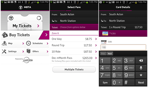
The process for purchasing tickets is straight forward, no complicated steps or black magic.

To purchase a round trip ticket to/from Boston the steps are:

1) Click ‘Buy Tickets’
2) Choose a ‘From’ and ‘To’ Station from the list.
3) Choose a ‘Round Trip’ ticket
4) Choose an existing card (the app stores a payment key after the first time).
5) Enter the Card CVV

mbta.workflow.new1

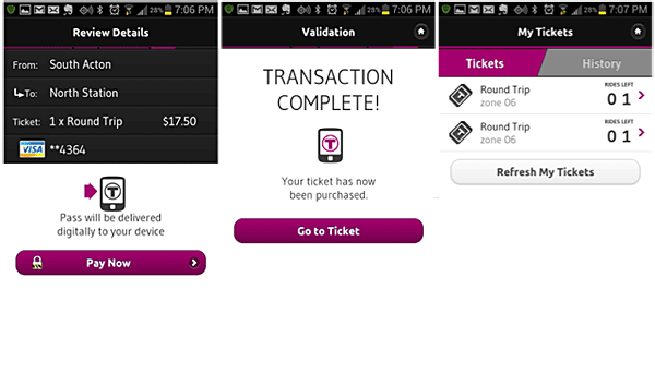
6) Review your purchase
7) Press ‘Pay Now’
8) DONE!

mbta.workflow.new2

Once the transaction goes through, the ticket is loaded into the My Tickets section. You now have two round trips to Boston waiting for you.

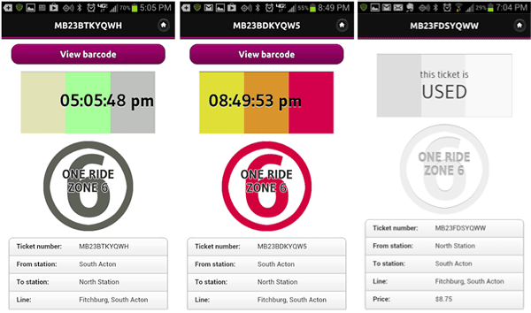
These last few panels are a shot of your ticket. The rectangle at the top shows the current time, the time block moves back and forth, and the three blocks are multi-colored. The color scheme changes on a daily basis according to a scheme that the conductor knows. Once the ticket is used it changes into a grey scheme. The conductor when he approaches will generally glance at the screen, nod with a “thanks” and put a paper slip in the holder above your head. Done.

mbta.workflow.new3

MBTA mTicket in the News

These are some of the online articles that were published before and after launch:

Apr 23rd, 2012

MBTA and Masabi team up for first smartphone rail ticketing system in the US, launching in Boston this fall

Jul 12th, 2012

New York MTA announces smartphone-based ticketing trials aboard Metro-North Railroad


July 11, 2012

New Smartphone App Could Replace Railroad Tickets


Nov 12, 2012

MBTA & Masabi Launch US` First Smartphone Commuter Rail Ticketing System

Jul 11, 2012

Digital train tickets to replace paper for some NY commuters


November 27, 2012

mTicket: MBTA releases mobile ticketing app at South Station

December 04, 2012

mTicket: T reports $225,000 in mobile app ticket sales since November launch

January 15, 2013

mTicket sees $1 million in commuter line sales


November 21st, 2012

What Bostonians Are Thankful For

November 27th, 2012

Mobile Ticketing Coming to MBTA Boats & More Commuter Trains, Riders Can Purchase Monthly Passes


Customer Respose

The MBTA mTicketing app went on to become a huge success shortly after launch. Customers reported a ‘seamless experience’ with ‘great usability’, ‘very convenient’, ‘neat & efficient’ etc.

These are some of the responses the MBTA customers tweeted shortly after launch:

Victory Motorcycle Competition

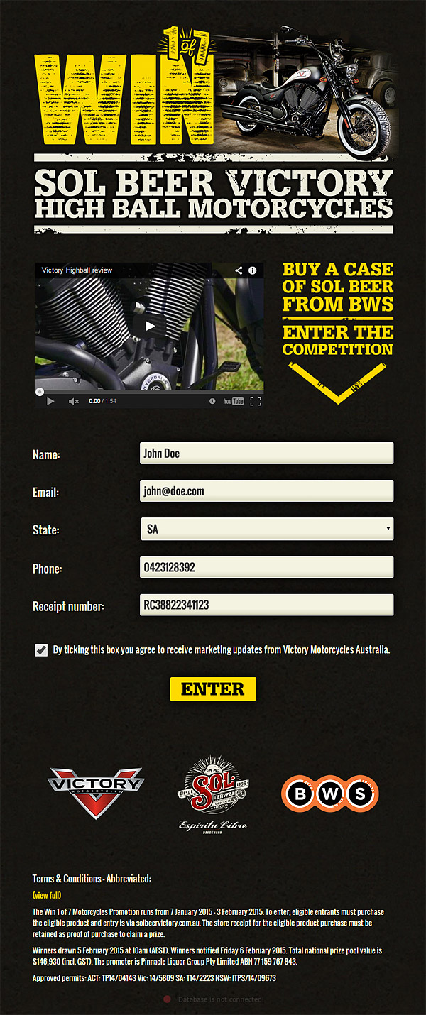
This was a design of a mobile-friendly competition for BWS and Victory Motorcycles. The competition was hosted by RedJelly and ran over a period of 30 days.

motorcycle_competition.main

Pepsi Project Refresh

A global-reach social media campaign for renown household brand. This project involved designing an interface for a competition mechanics application with some of the latest technologies such as RESTful AJAX, jQuery, jQT, Qunit, HTML5, GitHub, Ruby on Rails all delivered over Amazon’s E2 Cloud delivery network.

The Pepsi Project Refresh
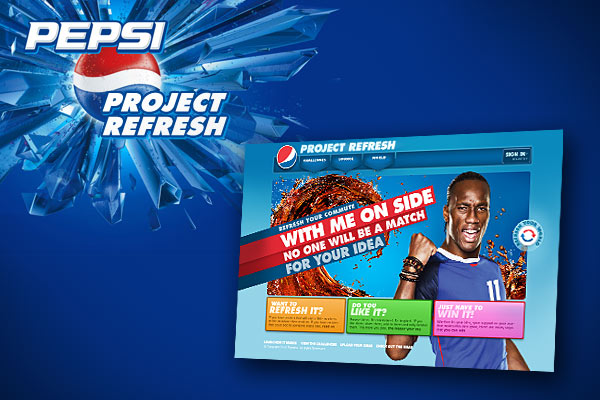
Pepsi Project Refresh – Global Competition Campaign

The Pepsi Refresh Project is an international social-media campaign aimed principally at teenagers and young adults, Pepsi’s main consumer base.

The project involved working with other skilled interface developers to customize the GUI and enhance an existing competition-mechanics platform (supplied by Global Dawn, a London-based specialist software developer) to provide Pepsi with the ability to create and judge competition rounds using bespoke rules, giving users have the ability to upload content and rate other user’s content all using Pepsi’s familiar blue branding.

Rich User Interface Technology

The principal technology stack of the project was RESTful AJAX over Ruby on Rails, this meant a highly-responsive UI that required minimal refreshing of the browser’s window. The main frameworks used for this were jQuery and QUnit(for unit testing).

Compatibility requirements meant unit-testing across various browser platforms.

A distributed team across several geographical areas meant using a robust and well-known Source Control and Bug-tracking platforms, GitHub, the platform of choice for many open-source projects was used for this purpose. Jira, another excellent solution provided by Atlassian, was used mostly for bug-tracking and task management.

Amazon Cloud
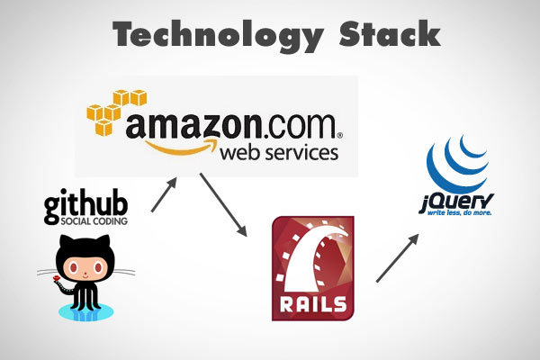
Various Technologies used for the Project

In order to improve high-volume delivery across all international location, the project used Amazons EC2 CloudDelivery Network.

Global Release

At then end of the project, the platform was localised and released across various international site. Russia and Italy being the first two participants in the competition.
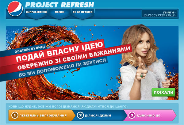
Russian Site: platform was localised and delivered across various International Sites.

User-Generated Content

The key to the low-maintenance requirements of the competition is that users generate their own content. They upload videos and images, and they get to vote on videos and images provided by other users. According to Global Dawn’s 1-9-90 competition technology, some users tend to provide the majority of traffic and content in a site, hence these users are rewarded with ‘points’ to spend across the site as they see fit.
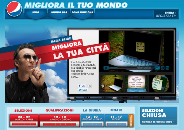
Italian Site: Users upload their own content and vote on other people’s content.

Competition mechanics are designed by brand managers (Pepsi in this case), they choose different parameters such as the duration of the competition, number of stages etc.