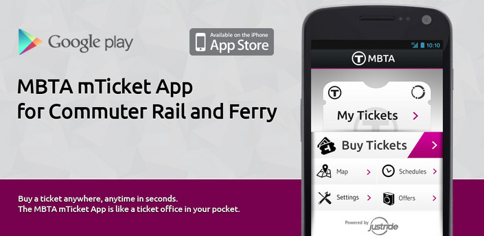
A 6 month cross-platform (iOS and Android) mobile app project for Masabi, a specialist mTicketing company based near London Bridge. The MBTA mTicket application was launched in the Android and iPhone app markets in November 2012, and was a complete success grossing $1 million of sold tickets in the Boston Rail network for the first ten weeks of operation.
Developing the Front End User Experience
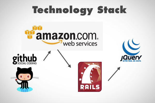
The project focused on building the User Interface for the application, this was done as a HTML5 /JavaScript UI due to the inherent advantages in being able to share code across different platforms. During development, we regularly tested against Android, iOS, BlackBerry, Symbian WebOS and Windows Mobile.
MBTA mTicket Payment Walkthrough
The process for purchasing tickets is straight forward, no complicated steps or black magic.
To purchase a round trip ticket to/from Boston the steps are:
1) Click ‘Buy Tickets’
2) Choose a ‘From’ and ‘To’ Station from the list.
3) Choose a ‘Round Trip’ ticket
4) Choose an existing card (the app stores a payment key after the first time).
5) Enter the Card CVV
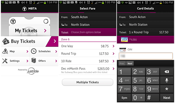
6) Review your purchase
7) Press ‘Pay Now’
8) DONE!
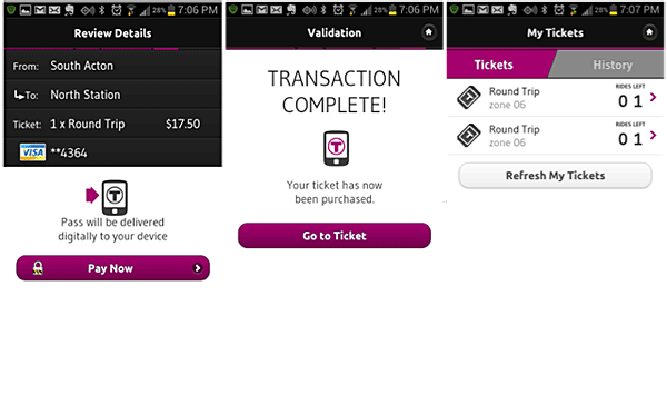
Once the transaction goes through, the ticket is loaded into the My Tickets section. You now have two round trips to Boston waiting for you.
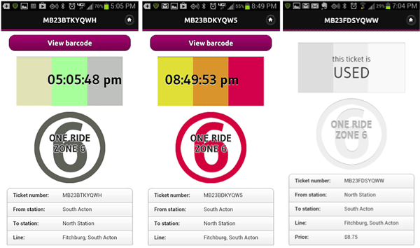
These last few panels are a shot of your ticket. The rectangle at the top shows the current time, the time block moves back and forth, and the three blocks are multi-colored. The color scheme changes on a daily basis according to a scheme that the conductor knows. Once the ticket is used it changes into a grey scheme. The conductor when he approaches will generally glance at the screen, nod with a “thanks” and put a paper slip in the holder above your head. Done.
MBTA mTicket in the News
These are some of the online articles that were published before and after launch:

Apr 23rd, 2012
Jul 12th, 2012
New York MTA announces smartphone-based ticketing trials aboard Metro-North Railroad
![]()
July 11, 2012
New Smartphone App Could Replace Railroad Tickets

Nov 12, 2012
MBTA & Masabi Launch US` First Smartphone Commuter Rail Ticketing System
Jul 11, 2012
Digital train tickets to replace paper for some NY commuters

November 27, 2012
mTicket: MBTA releases mobile ticketing app at South Station
December 04, 2012
mTicket: T reports $225,000 in mobile app ticket sales since November launch
January 15, 2013
mTicket sees $1 million in commuter line sales

November 21st, 2012
What Bostonians Are Thankful For
November 27th, 2012
Mobile Ticketing Coming to MBTA Boats & More Commuter Trains, Riders Can Purchase Monthly Passes
Customer Respose
The MBTA mTicketing app went on to become a huge success shortly after launch. Customers reported a ‘seamless experience’ with ‘great usability’, ‘very convenient’, ‘neat & efficient’ etc.
These are some of the responses the MBTA customers tweeted shortly after launch:
Just bought my first mobile #mbcr ticket with the new #mbta mTicket app. Super easy, great interface. Will def. make life easier
@mbtagm
— Beth Vitale (@vitale_beth) November 12, 2012
I absolutely love the new #mbta commuter rail app. It’s so convenient and easy. #greatjob
— Colin Loiselle™ (@colinloiselle) November 12, 2012
Whoever created this MBTA app is an actual angel from heaven
— connor (@connorlately) November 13, 2012
.Just used the #MBTA mTicket app on my #Android phone. Pretty neat & efficient! #ilovetechnology cc: @mbtagm
— Meg McDevitt (@OhThatMeg) November 14, 2012
MBTA’s making mobile e-tickets for the Commuter Rail now?! No more waiting in line and missing the train! WOO
— Timmy C (@_LeTimmy) November 13, 2012
Transforming #transit @masabi_comRT @bostonglobe: The MBTA says its smartphone ticket app for commuters is a hit b.globe.com/RDCmot
— Elizabeth Towler (@LizTowler) November 15, 2012
@mbtagm downloaded the #MBTA mTicket App today. real cutting edge!
— eileensideways (@eileensideways) November 19, 2012
This app just made my life so much easier. play.google.com/store/apps/det…
— Patrick Rodriguez (@LightAesthetic) November 18, 2012
.@mbtagm the new commuter rail ticketing app is amazing. I love it. #mbta #boston
— cool dr money (@xieish) November 18, 2012
@mbtanow Love the new MBTA Ticketing App!
— Owen (@OFenwick) November 17, 2012
Mbta app is dope
— John M. Billert (@_billert) November 16, 2012
Been using #MBTA app this week on the commuter rail – so far, so good! Very convenient. @mbtagm
— Ashley (@accordingtoalg) November 16, 2012
